Site Maps
I worked with another designer proposing different flows and site maps for how to condense the site content into five main navigation pages that encouraged users to explore different areas of the site.

The International Photographic Council (IPC) is dedicated to increasing worldwide recognition of photography as a universal means of communication. Through a variety of efforts such as the awarding of scholarships to students and the recognition of professional photographers annually at the UN, IPC continues to promote photography in the spirit of its motto: “Peace Through Photography, the Universal Language.”
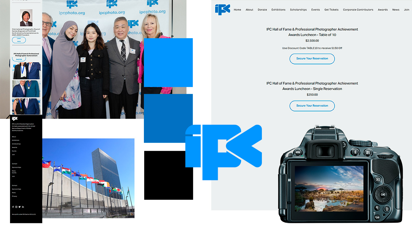
IPC underwent a transfer in leadership and was interested in redesigning their site to attract to younger photographers and current students. The existing site was template based, which offered limited customization and often caused the site to break on mobile viewpoints, which drove most site traffic.
I worked with another designer proposing different flows and site maps for how to condense the site content into five main navigation pages that encouraged users to explore different areas of the site.
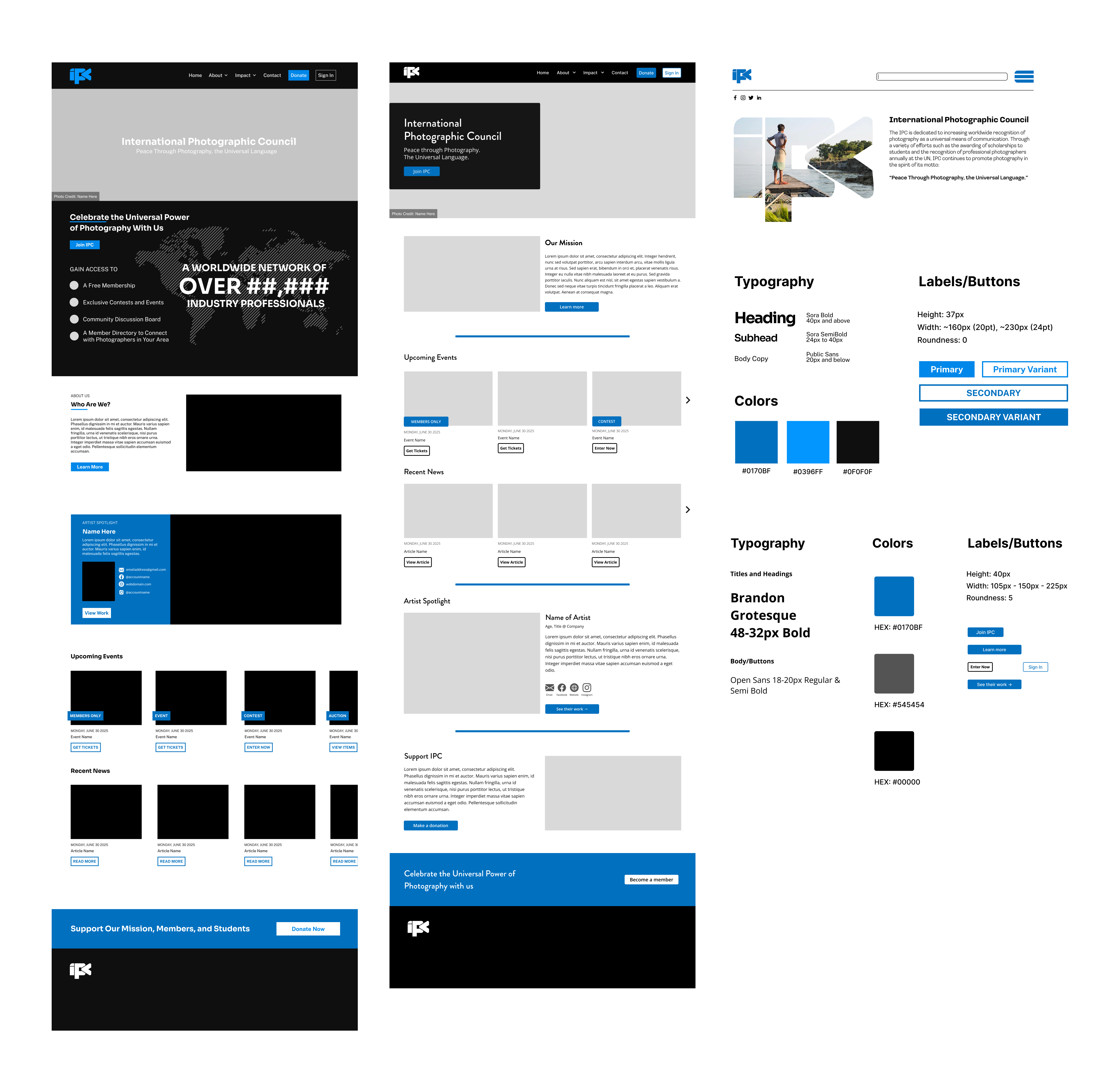
Each of the team's designers proposed a different style direction for the site. My wireframe, pictured to the furthest left, was chosen as the main style and direction with elements incorporated from the middle wireframe, like the arrow navigation.
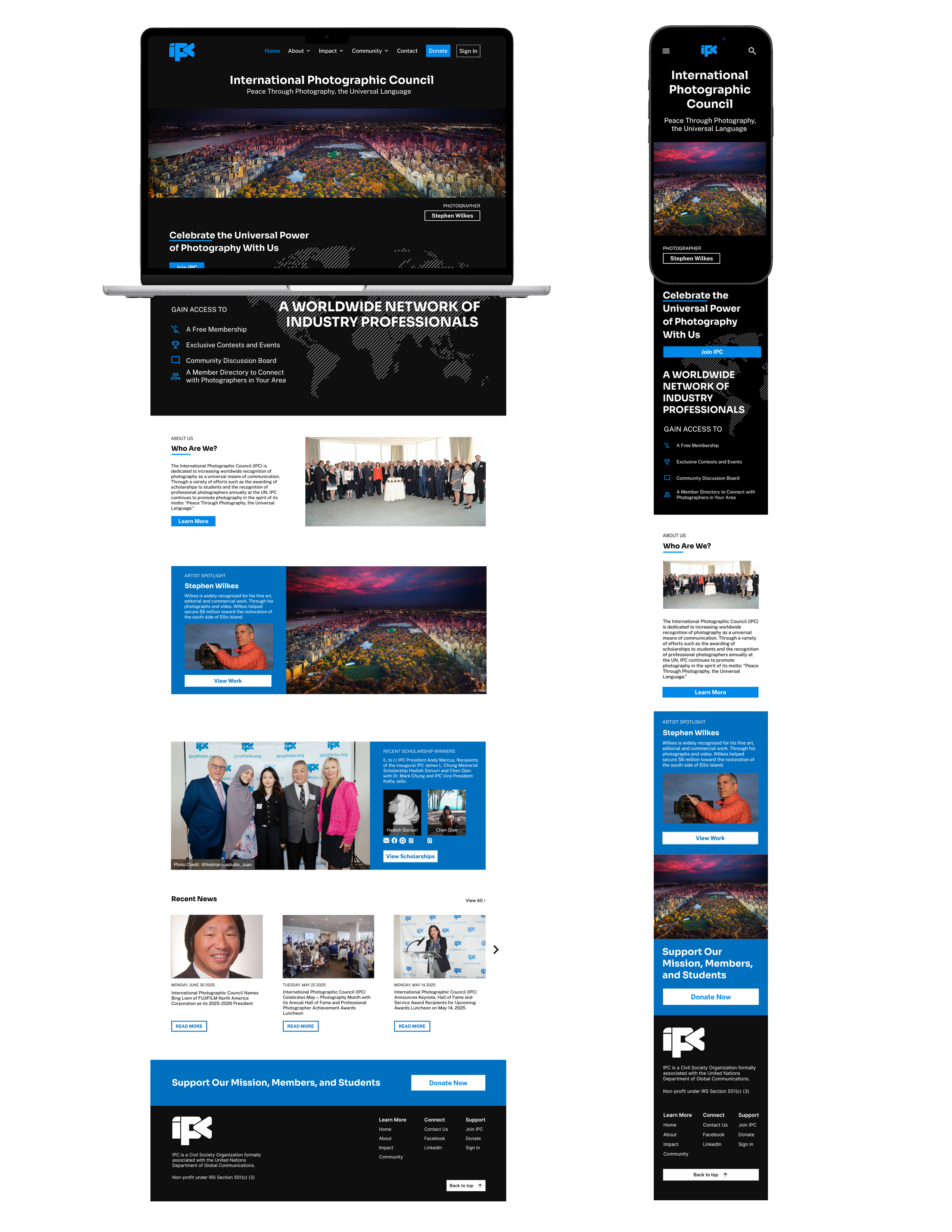
Using photos provided by the IPC and its members, the team and I developed a series of global styles, including buttons, banners, and posts, that could be placed into different areas of the site with switched content.
The site uses three breakpoints: a mobile, tablet, and desktop view to ensure that photos and content are all visible and cohesive no matter the viewing device.
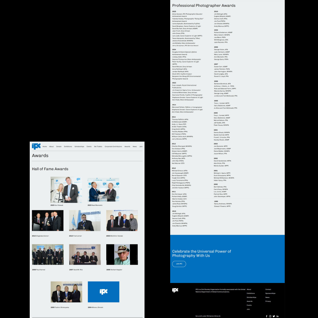
The redesigned website took long lists of award recipients and transformed it into an interactive experience that was less overwhelming, easier to read, and took up less space.