↑
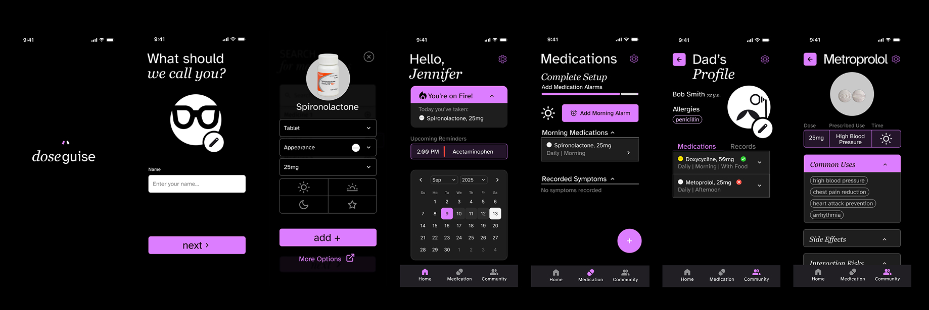
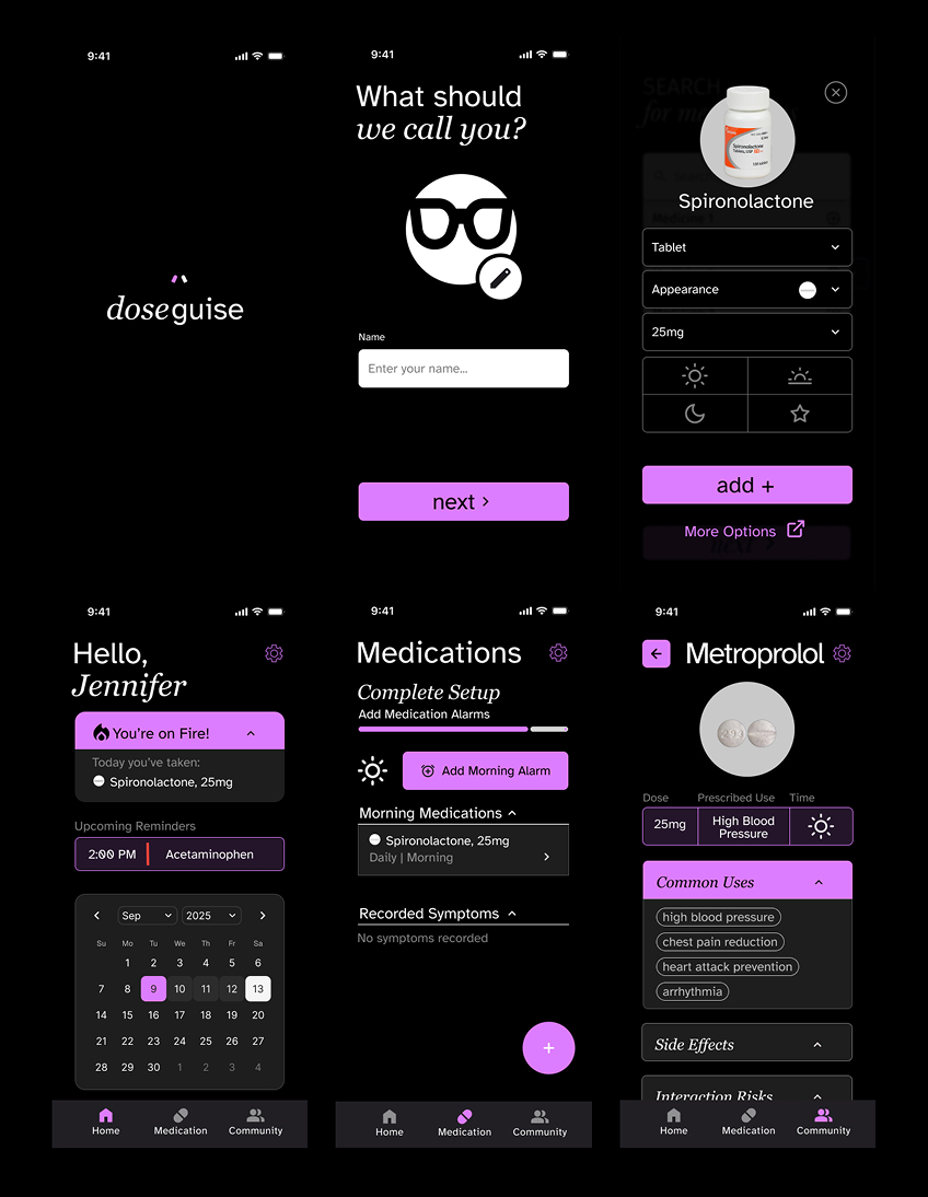
Five key app screens

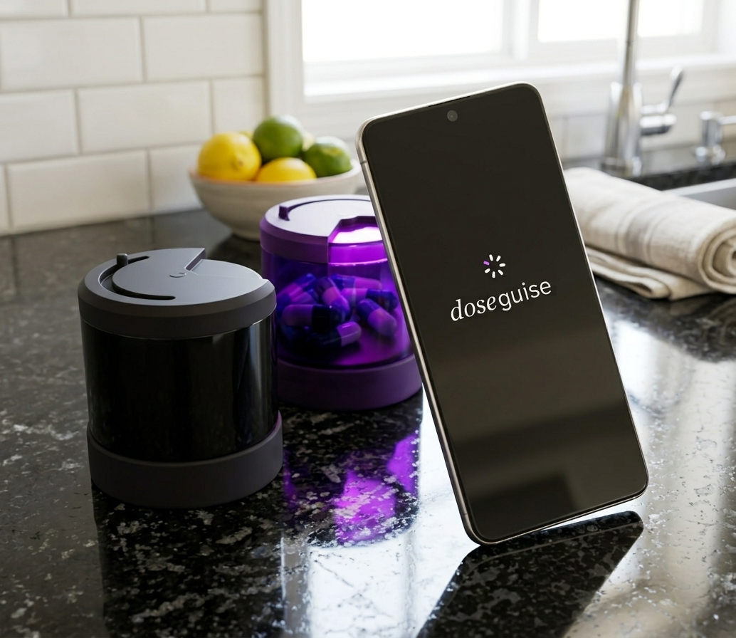
App concept for discreet medication management for cargivers, elders, and communities. Doseguise aims to make medication management easier for everyone. It's based around flexibility, so it can be used by a caregiver or elder for their own medications, but also to check in on friends and family members without hounding them through calls and texts.

Doseguise / Product Design

Figma, Adobe Illustrator


UI/UX Designer, Product Designer

Families exploring the museum's newly expanded galleries

the challenge

I have first-hand experience with caring for my grandparents, one of which had been diagnosed with Alzheimer's. Because Doseguise aims to be used by everyone, the design had to have accessibility considerations for the elder while still having consistent app standards to be recognizable to nurses and caretakers.

the approach

Hand-marked floor plan of the museum's expanded galleries showing visitor traffic patterns

Sketching

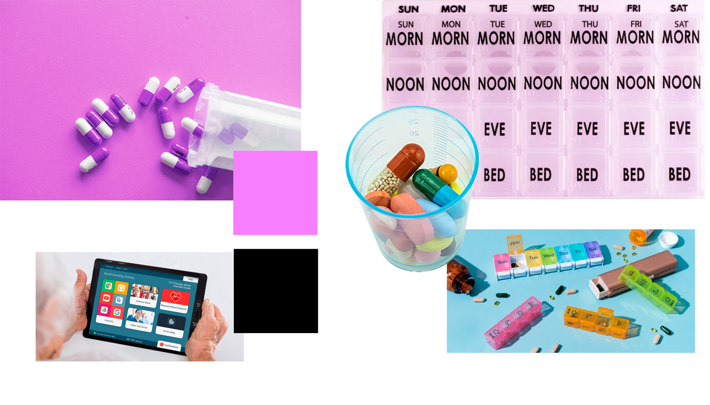
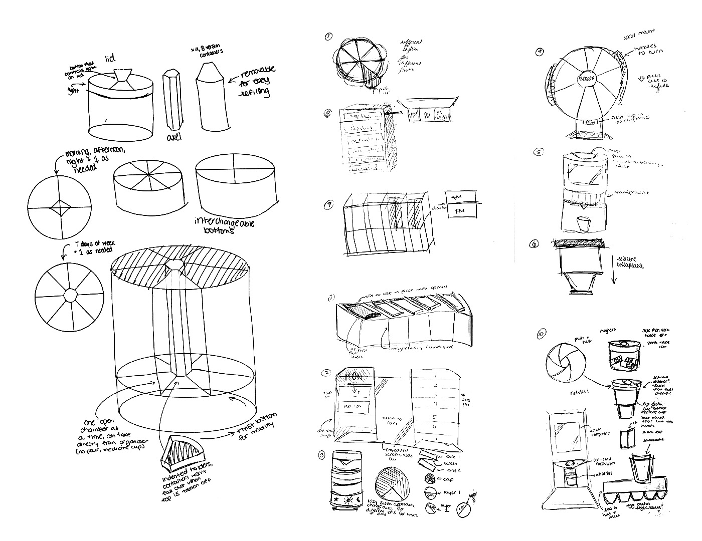
Because the brief required a physical component, I began with sketching product concepts to understand how a corresponding app would function. I explored both high and low tech solutions, as well as different displays and opening mechanisms.
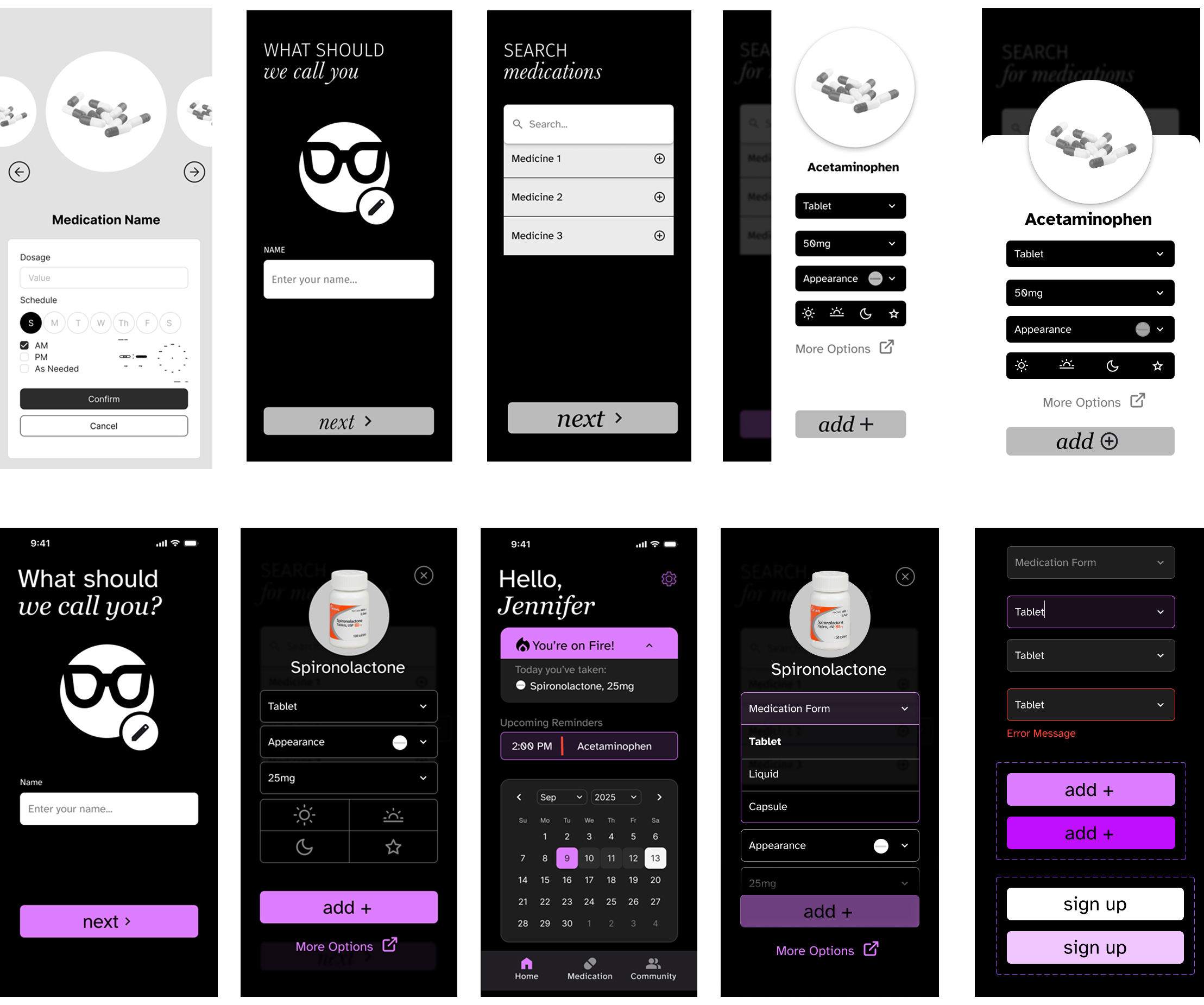
Low-fidelity wireframe sketches of the kiosk's question-first touchscreen interface

Establishing style and heirarchy

I explored different layouts and styles to optimize space for larger text and buttons without making pages too scroll heavy or content hard to access. I also established a system for visual feedback, including primary and secondary buttons, filled and empty states, and error messages to make sure that every user action had visual cues.
Final high-fidelity visual design of the kiosk in the museum's brand colors

Building the physical component

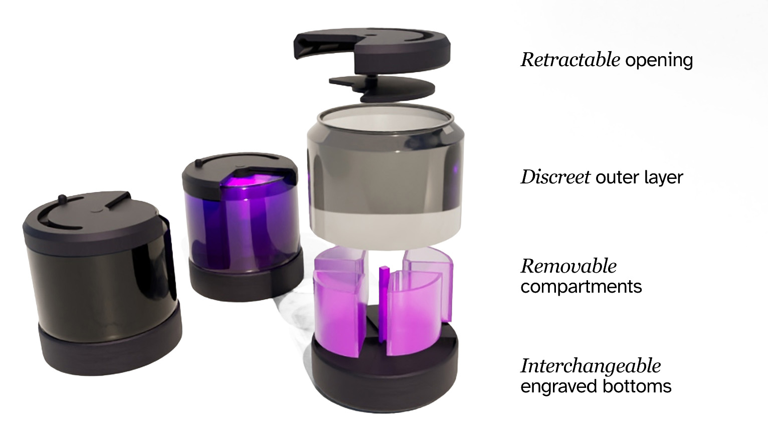
The final pill organizer was modeled in Maya. It uses a twisting bottom to be accessbile to user with limited finger mobility since it can be moved using a flat palm. Pills can be swallowed directly from the organizer without being emptied into a palm or a medicine cup, which reduced spill risk.

the result

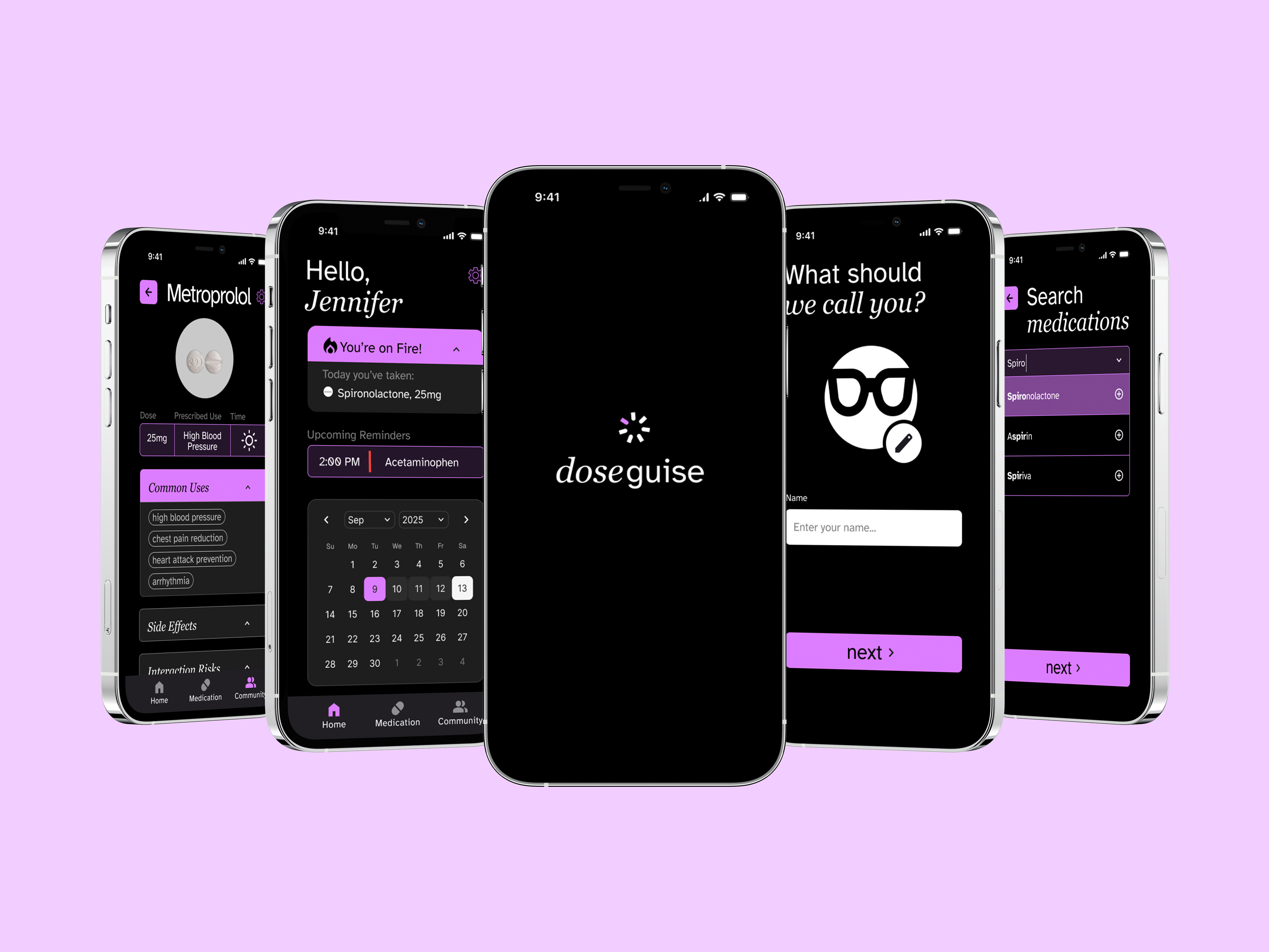
The final app has a caretaker and elder view. Doseguise never goes below 20px copy and all buttons are at least 70px high and full width, making them easy to touch. The app is constantly giving the user feedback on what medication they have or haven't taken, and important information is surrounded by purple, which has been proven to promote memory.

Graphic showing how adults, wheelchair users, and children are all able to reach kiosk navigation Graphic showing how adults, wheelchair users, and children are all able to reach kiosk navigation

the brand

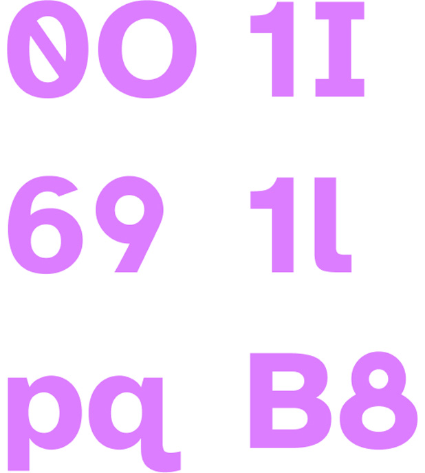
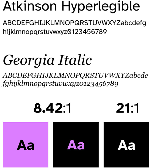
The app uses Atkinson Hyperlegible and Georgia as main typefaces, both tested with low vision audiences and proven to hold up well on low resolution screens and older phones.

Quote in Brand Type reading Gotham and Barlow Condensed Type Specimens
Mother and daughter in front of kiosk