Sketches & Ideation
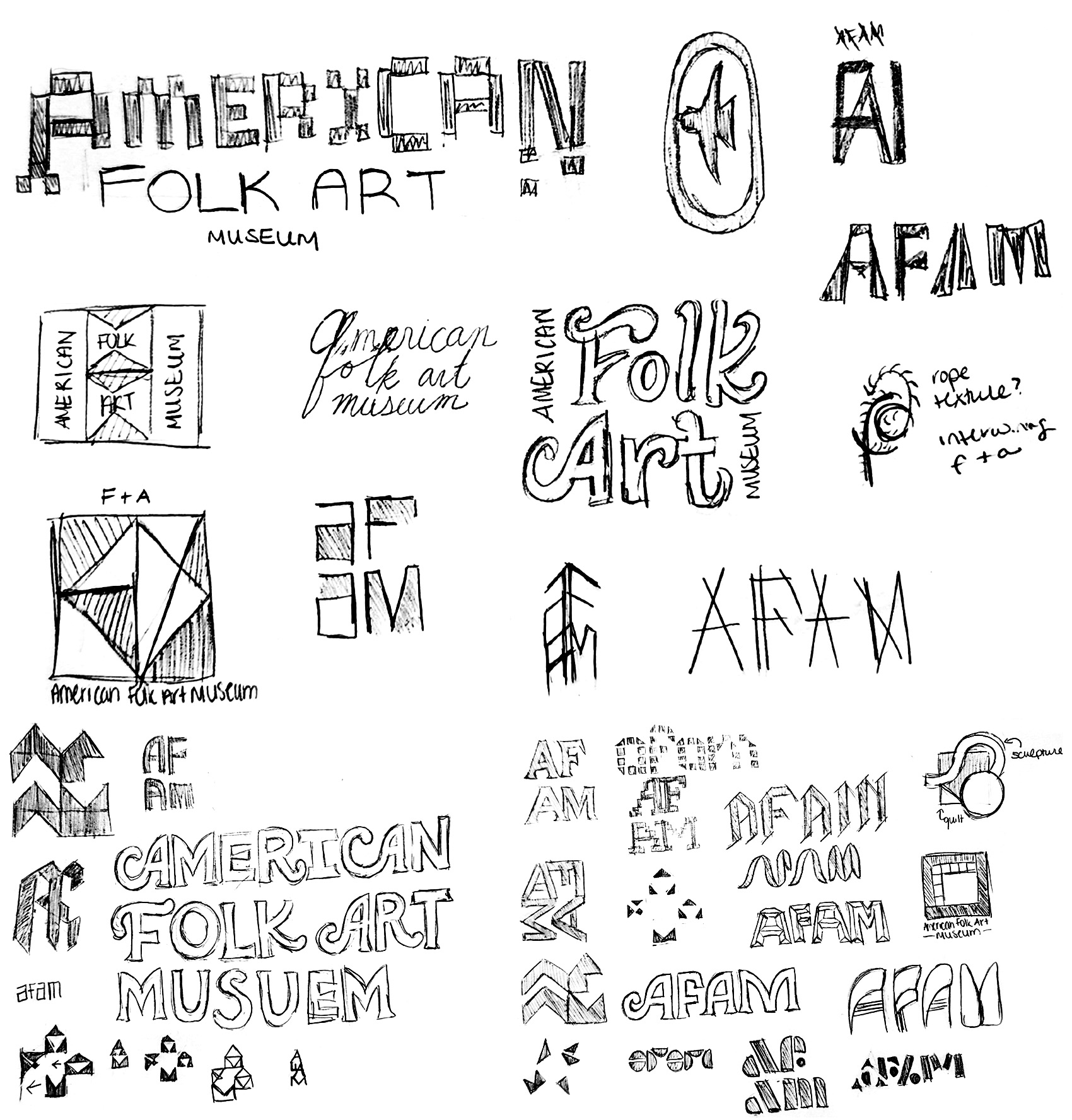
I began by sketching different layouts, primary and secondary marks, and name abbreviations, pulling in inspiration from folk art through materials, medium, and historical typography.

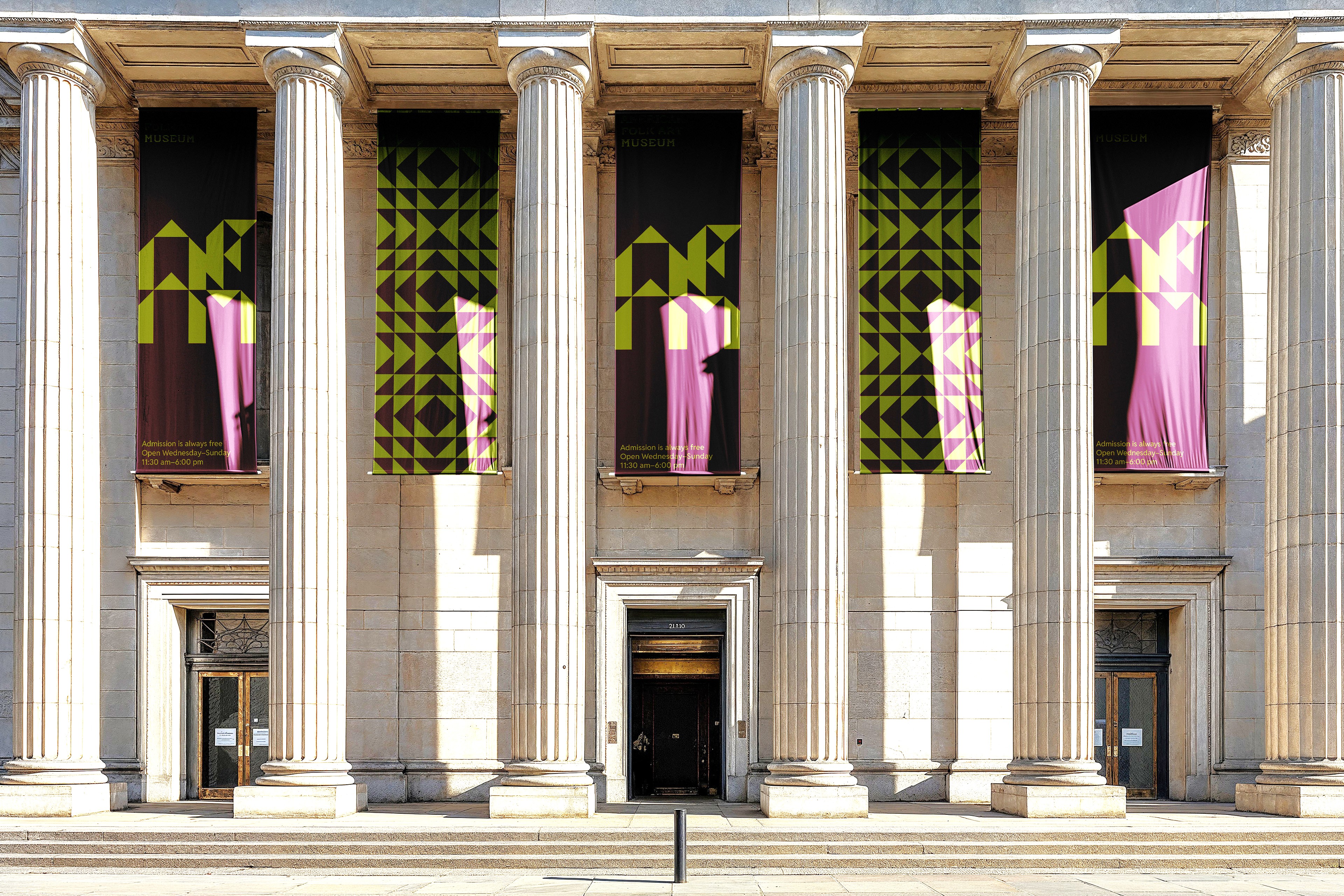
The American Folk Art Museum is New York City’s only museum dedicated to folk & self-taught artists. With art reflecting personal experience rather than formal artistic training, the museum is perfect for families, students, and educators. The museum maintains a diverse selection of pieces, including books, models, and paintings, but their collection on quilts and textiles is the most popular.
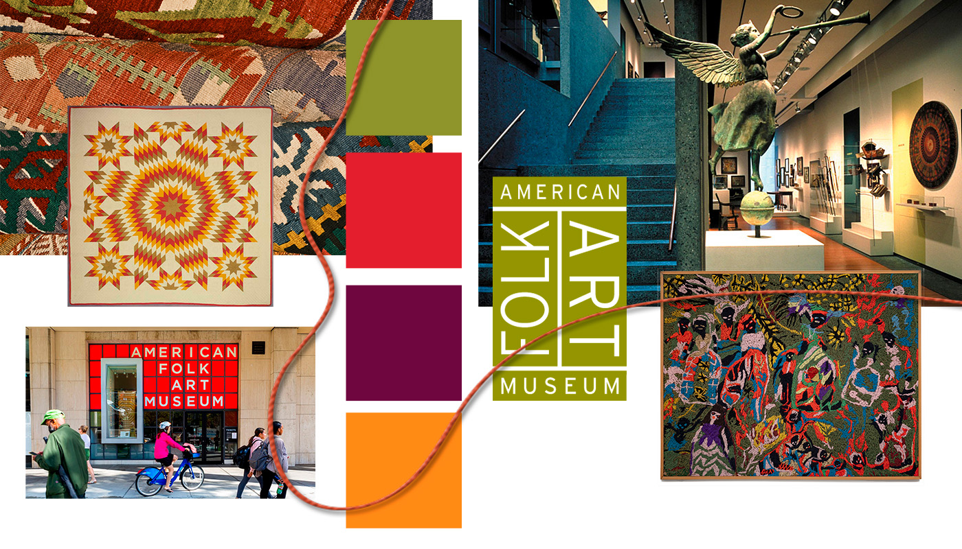
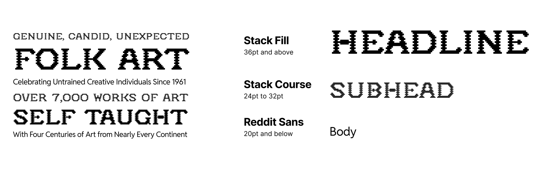
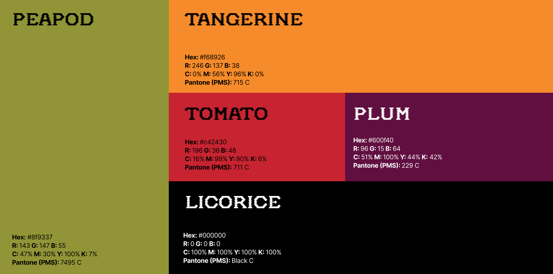
The American Folk Art museum is home to some of the most tactile and personable art in New York City. However, its branding feels corporate and disconnected from the identity present in its art. In this redesign, I attempted to keep brand recognition in color, but added meaning to the museum’s logo and texture into its patterns and typography.
I began by sketching different layouts, primary and secondary marks, and name abbreviations, pulling in inspiration from folk art through materials, medium, and historical typography.
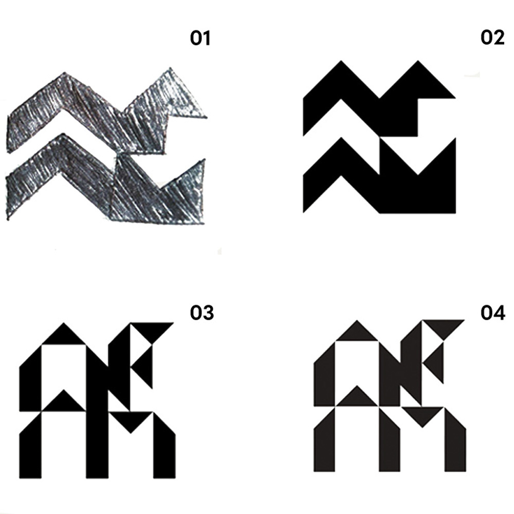
I then ideated on one of the abstract symbols, experimenting with different shapes to find the most legible mark.
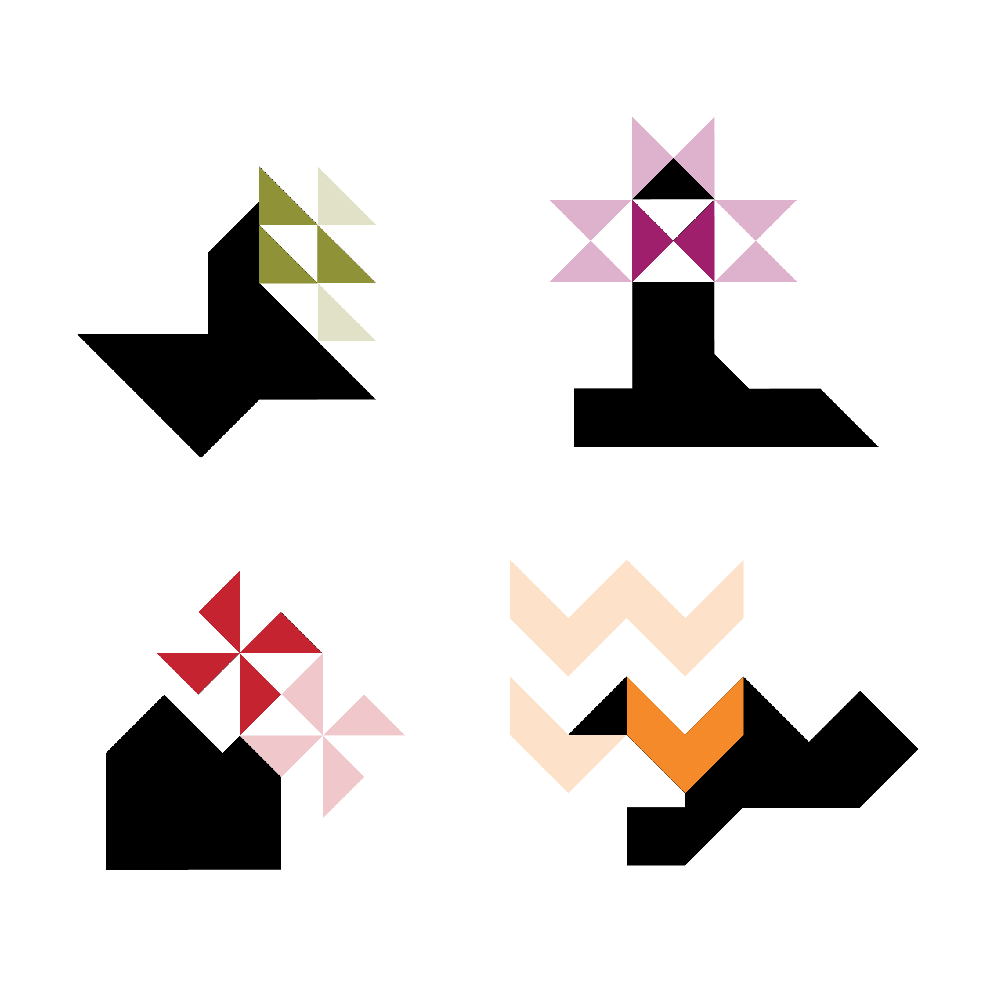
The resulting symbol is built on an isometric grid. Activitating different triangles within the grid can form common quilting patterns, which work as a logo animation that showcases both the logo and the meaning behind it.

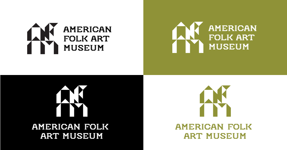
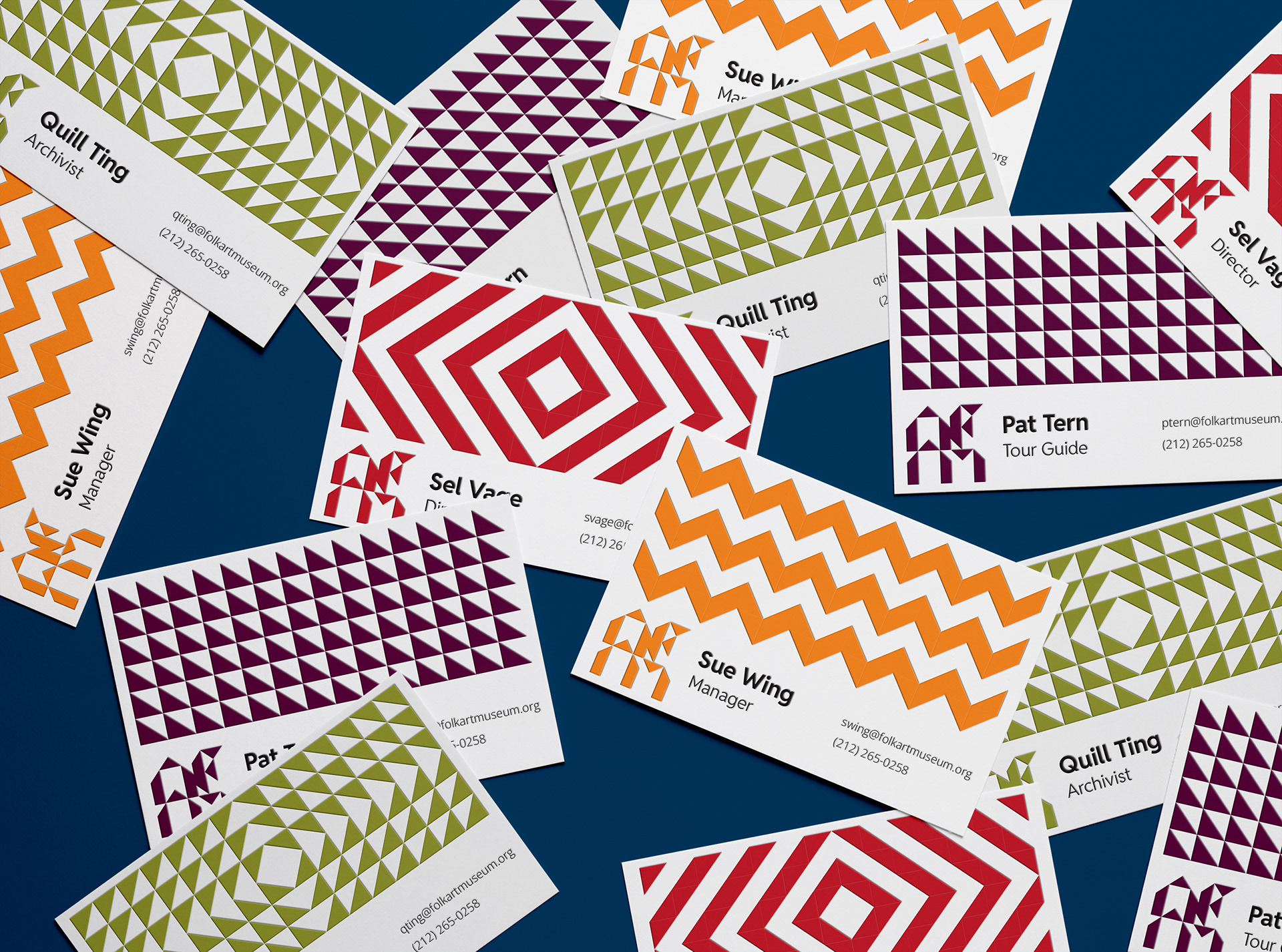
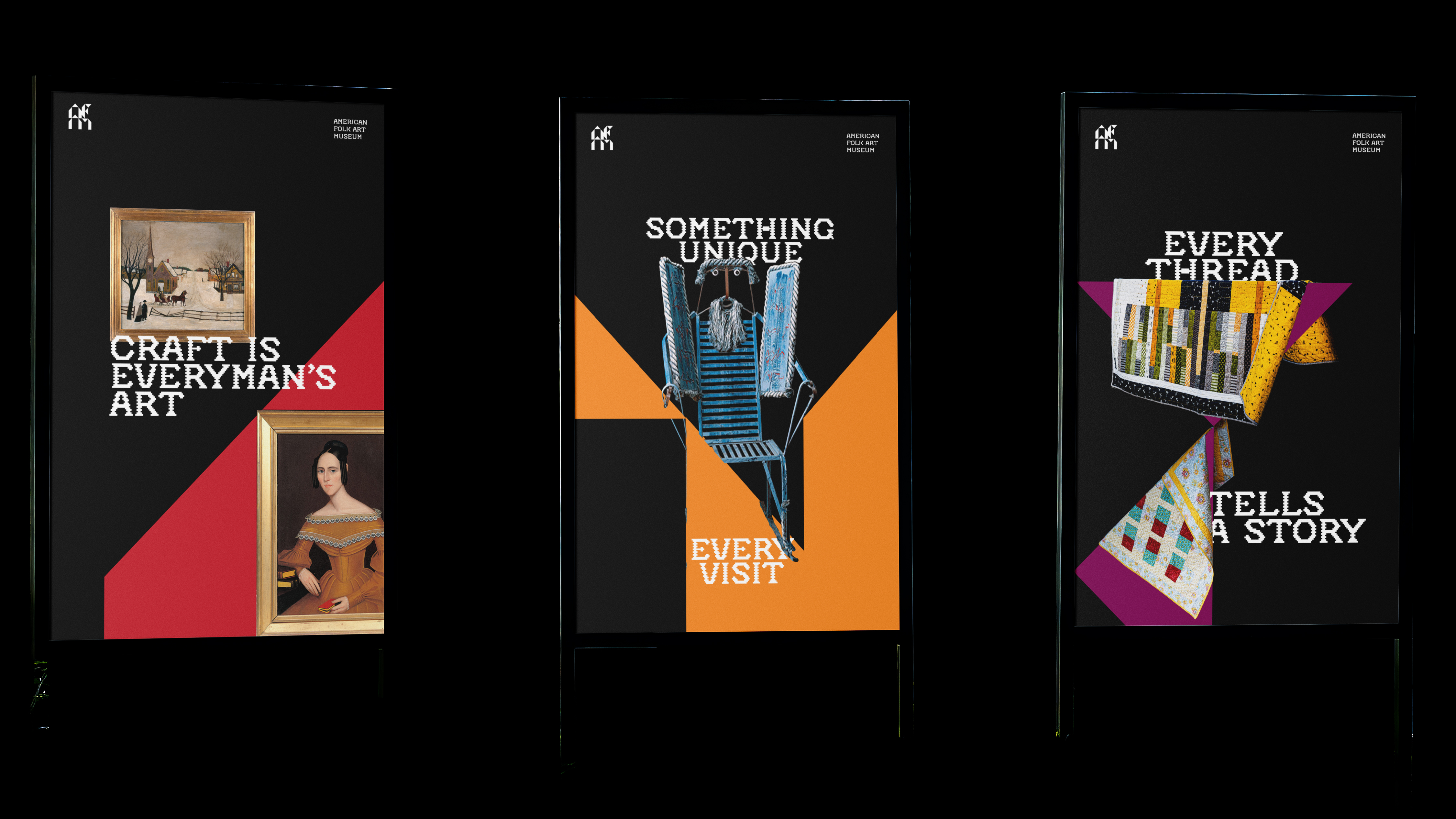
This redesign is more than a logo, it's an identity. The mark itself is used as a frame for showing off collections in advertisements. The logo's base in triangles is a motif throughout the brand, used as patterns in business cards and as unique card styles on the website.

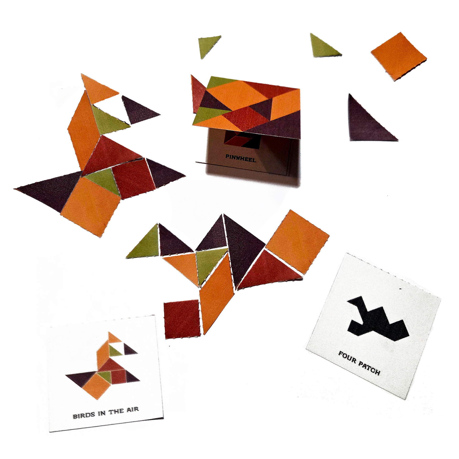
A branded game of tangrams, which showcases historical quilting patterns, utilizes the brand colors, typography, and triangle motif shows how the new identity caters to the museum's history and primary audience of students and educators.