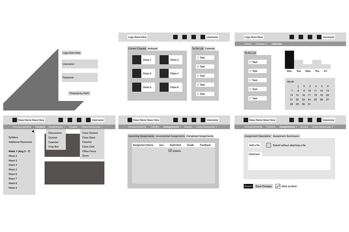
Wireframes
After conducting user interviews and combining my own expeirience, I wireframed a series of screens that eliminated page scrolling and added requested features, like an unsubmit button.

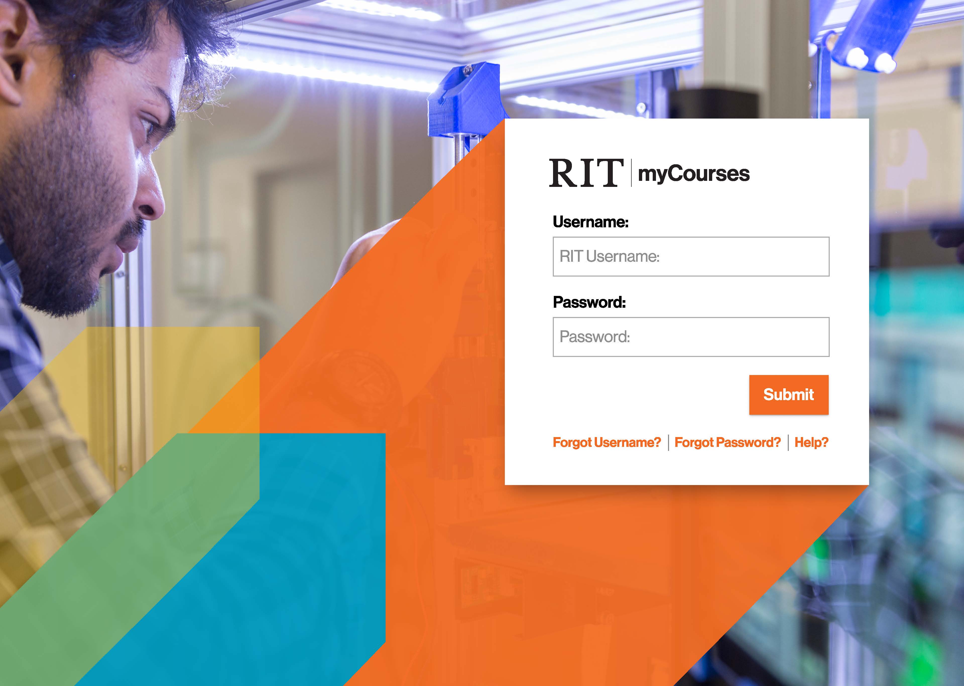
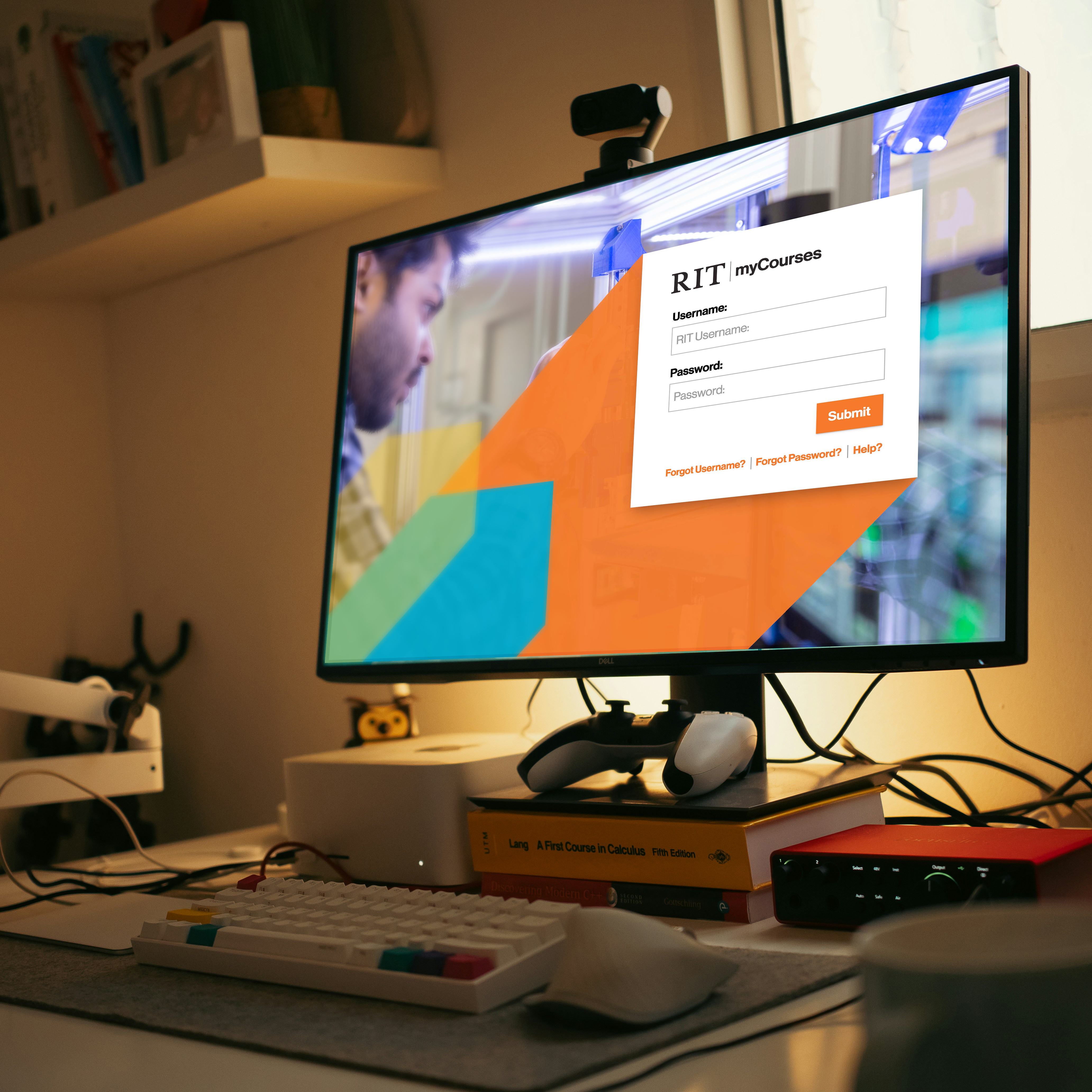
myCourses is the Rochester Institute of Technology's site used for accessing class content, homework assignments, quizzes, and grading. It has a teacher and student view, and uses a partner app, Pulse, for mobile use.
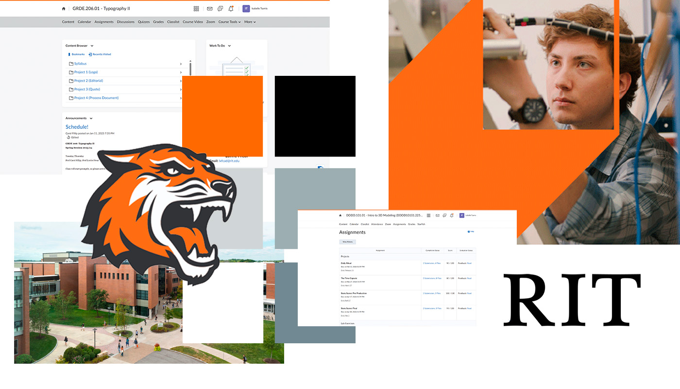
The website is extremely busy and lacks informational hierarchy. Website notifications cause the webpage to scroll longer than necessary, and the webpage has many features that current users don't use that take priority over pages users actual care about.
After conducting user interviews and combining my own expeirience, I wireframed a series of screens that eliminated page scrolling and added requested features, like an unsubmit button.
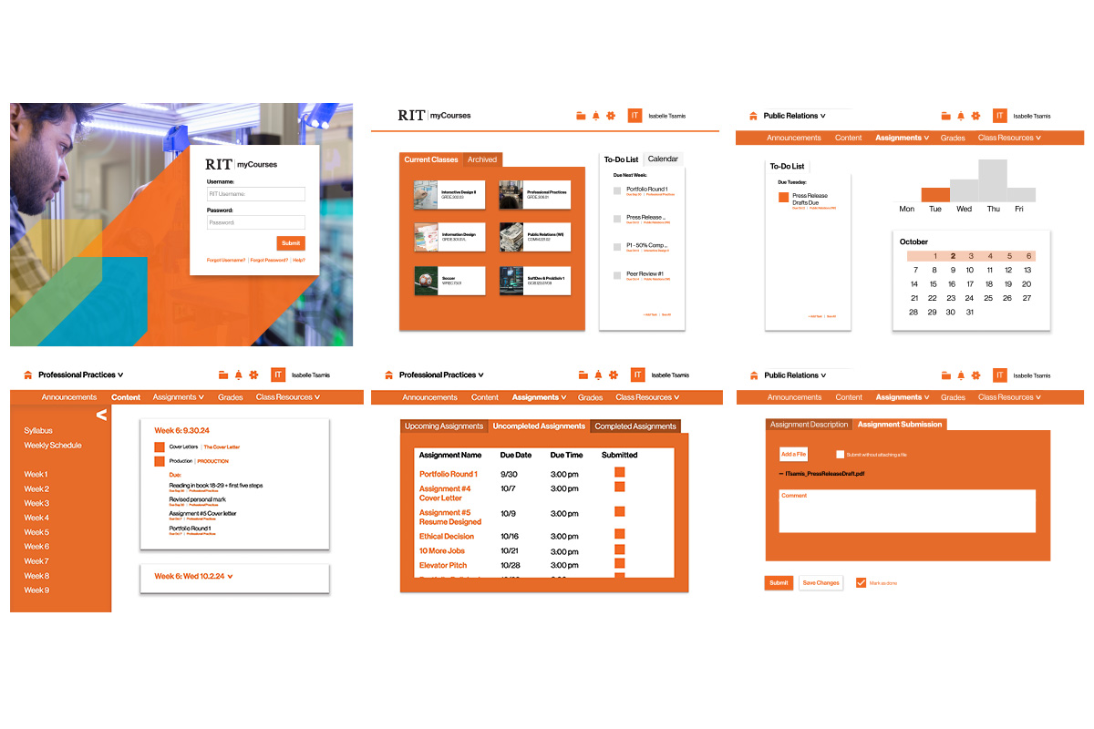
To test the success of the layout, I added real class content from pass semesters to make sure the design could successfully function without feeling cluttered.
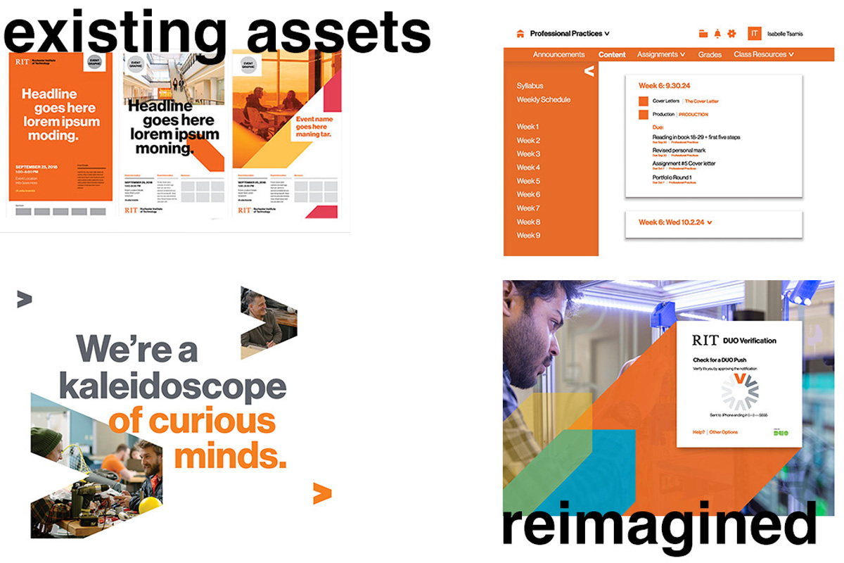
To add heirarchy and visual interest while staying within RIT brand guidelines, I replaced common UI elements, like carrots and box shadows with specific RIT assets.



The final redesign stays true to RIT brand guidelines while improving functionality by reorganizing information and optimizing page space using in-box scrolling and collapsible side menus.